


Are you in search of expert digital marketing solutions tailored to your specific business, blog, or event? Look no further.
We proudly serve businesses in Connecticut, and beyond, catering to enterprises of all sizes. Efficiency is key in this fast-paced digital landscape. Time is of the essence. Our commitment to swift project delivery ensures that your online presence is optimized without delay. We personalize your service and recognize that each business is unique. We take the time to comprehend your objectives and develop tailored strategies that deliver tangible results.
Super Search Booster is always at Your Service. Open and effective communication is at the heart of our approach. You can count on direct access to me for any questions, ideas, or concerns. Our main goal is to elevate your business. Whether you require web design, internet marketing, copywriting, or a comprehensive package, we are here to transform your vision into reality.
Ready to Get Started? Reach out today, and let's work together to propel your business to new heights.
Contact Us Now for a Consultation
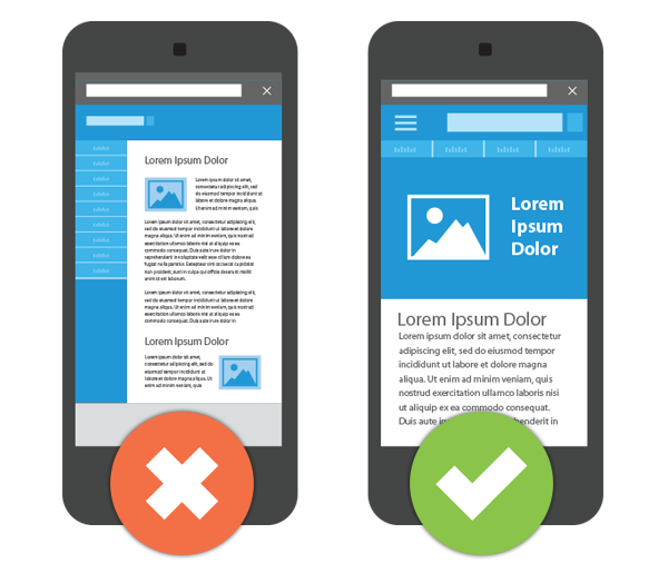
Is Your Website Responsive?
In the picture, you can clearly see the differences in viewing the same website. The one on the right is built for mobile with an easy-to-navigate menu, legible wording and quick contact functions.
Just because your site can be viewed on a mobile device does not mean it will be found when searching from it. SEO for mobile is necessary for a mobile website to be found. More Info
ENHANCE YOUR ONLINE PRESENCE WITH BUSINESS WEB DESIGNS
WordPress Web Design and Website Development Services
Do you want a custom-looking site that showcases your brand? Whether you need a WordPress website for your service business or a website with powerful eCommerce features to help you sell more products, we will skillfully create a custom-looking site that aligns with your company goals—and makes the behind-the-scenes process easy for you by using our strategic development process.
WordPress Design
Web Development
Website Maintenance
Website Security
SEO
eCommerce
Content Creation
Language Translation
ACCELERATING BUSINESS GROWTH ONLINE
Tailored Digital Marketing Solutions
Do you want to attract more visitors, engage more customers, or boost your sales? At Super Search Booster, we will craft a strategic online digital marketing plan for your business, and then help you implement it while tracking results. We optimize budgets and performance with Pay-Per-Click (PPC) Campaigns, Social Media Marketing, SEO and Inbound Marketing while taking care of all the details.
Search Engine Optimization
Pay-Per-Click (PPC)
Social Media Marketing
Content Creation